You’ll find 23 simple pot makeovers that bring clean lines, a cohesive palette, and layered texture to your plant display. Each idea pares back fussy details and focuses on tactile finishes—ombre sprays, chalk washes, geometric tape, faux cement, and more—so your containers look curated without fuss. They’re practical, weather-ready, and easy to adapt, with a few surprise touches that’ll make you want to try one more.
Spray-Painted Ombre Pots
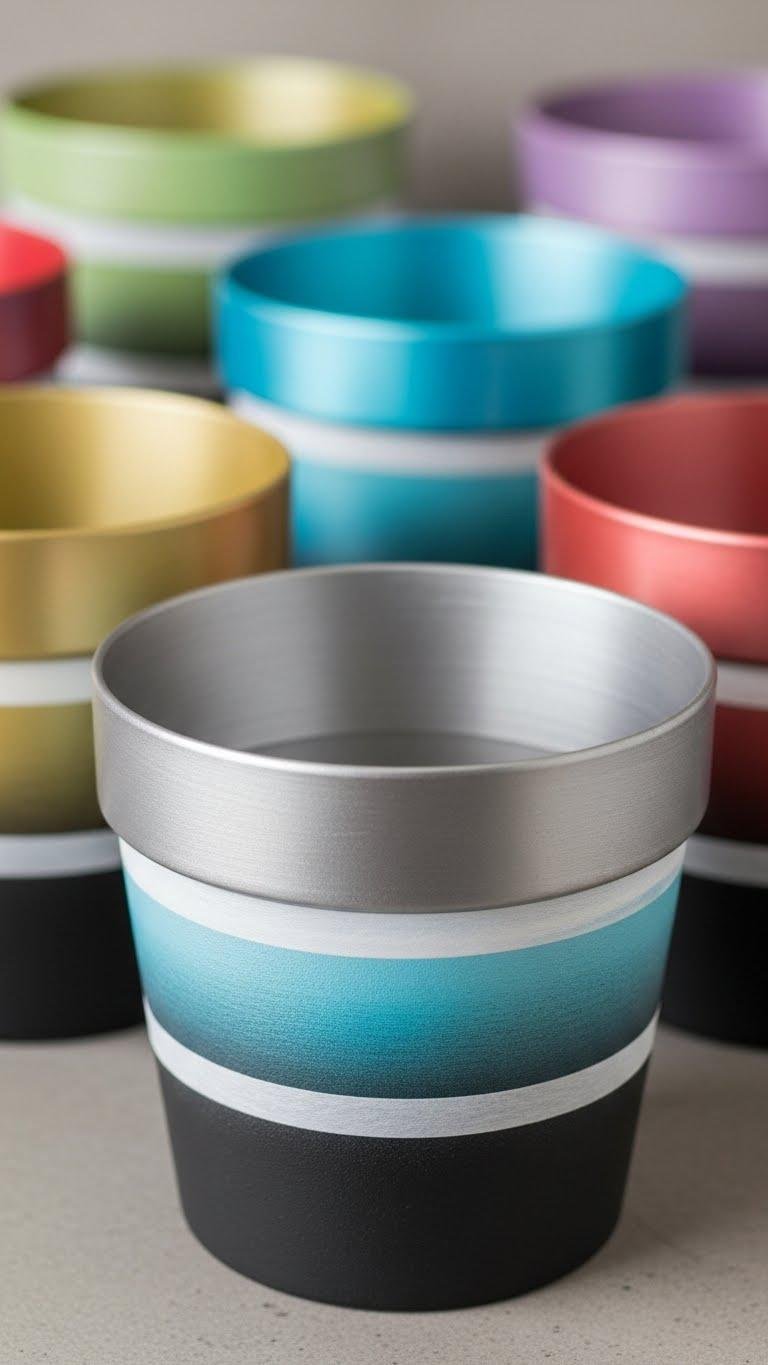
Often you’ll reach for a single color, but spray-painted ombre pots let you blend hues for a subtle, layered look that reads like a pared-back work of art.
You’ll mask clean bands, spray a metallic gradient at the rim, then soften into a matte ombre below.
The result feels restrained yet freeing — crisp lines, cohesive palette, and textured depth that invites personal expression.
Chalk-Painted Rustic Finish
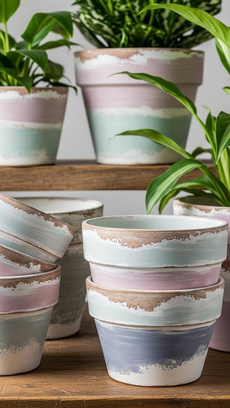
Give your pots a lived-in look by layering chalk paint for a rustic finish that feels both curated and effortless. You’ll sand edges, blend a cohesive palette, and soften contrasts for clean lines and layered texture.
Seal with matte wax to protect subtle wear, then rub back to reveal an aged patina. The result feels free, pared-back, and perfectly imperfect for your plants.
Geometric Tape Designs
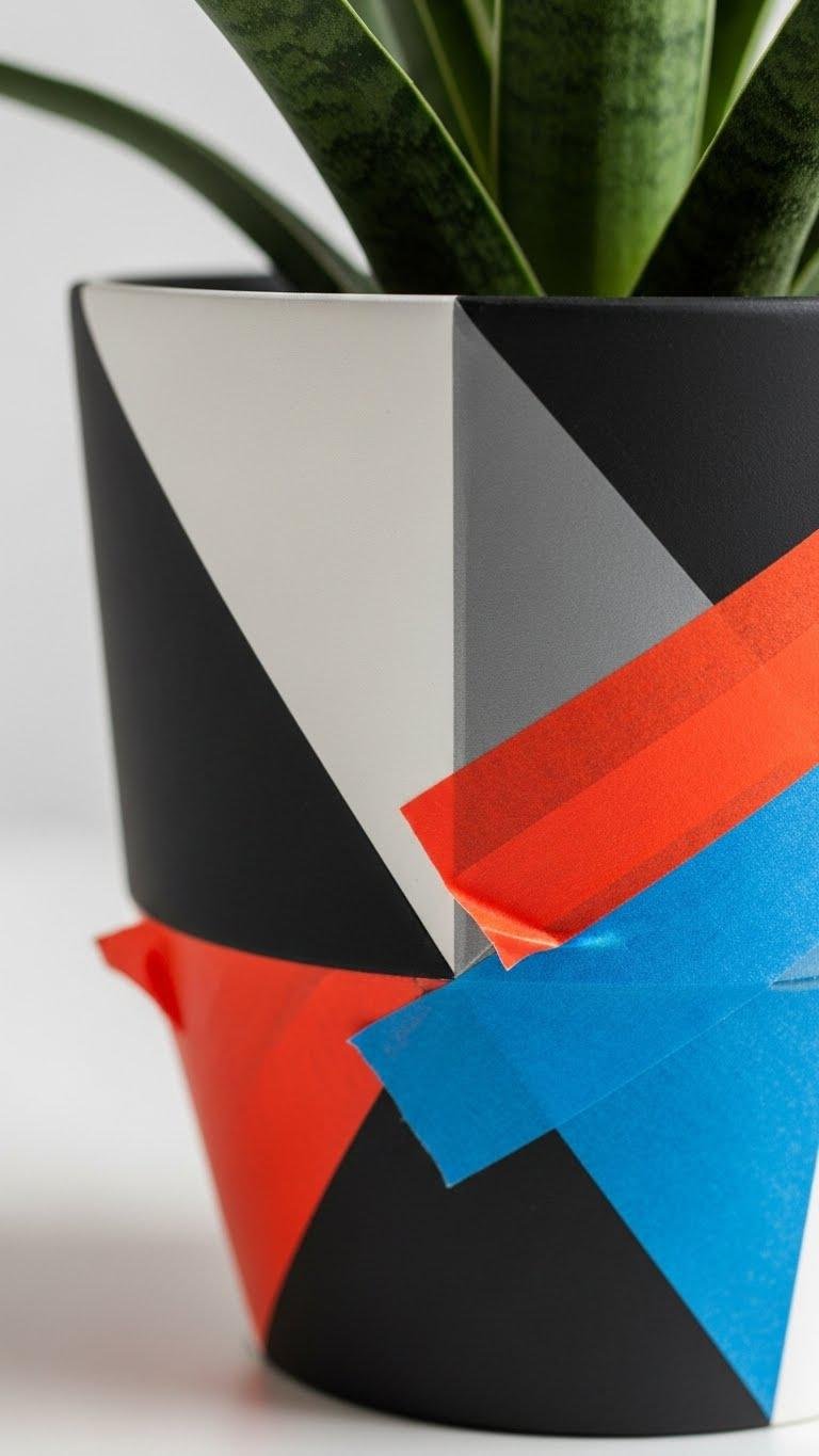
Mask off crisp shapes with painter’s tape to create modern, geometric patterns that feel deliberate yet approachable. You’ll use tape resist and angular masking to block color, building clean lines and a cohesive palette. Layer matte and satin finishes for texture, then peel to reveal bold contrast. This method gives you controlled freedom to personalize pots with minimalist, graphic statements.
Faux Cement Texture
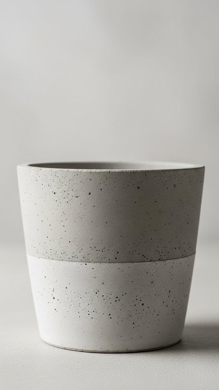
When you want a sleek, industrial look without heavy materials, faux cement gives your pots that cool, tactile surface with minimal fuss.
You’ll layer a microcement finish over clay or plastic, sand for subtle texture, then tint with concrete dye for a cohesive, muted palette. Keep lines clean, tools simple, and enjoy a liberated, modern result that feels deliberately understated.
Stenciled Botanical Patterns

Looking to add delicate, repeatable detail without fuss? You’ll love stenciled botanical patterns: crisp motifs in a cohesive palette layered over matte pots.
Use stencil repeat patterns for rhythm, then soften edges with tiny hand painted leaves to make each piece feel free and bespoke.
Work in clean lines, let texture build subtly, and enjoy a liberated, refined look for your plants.
Rope-Wrapped Boho Planters
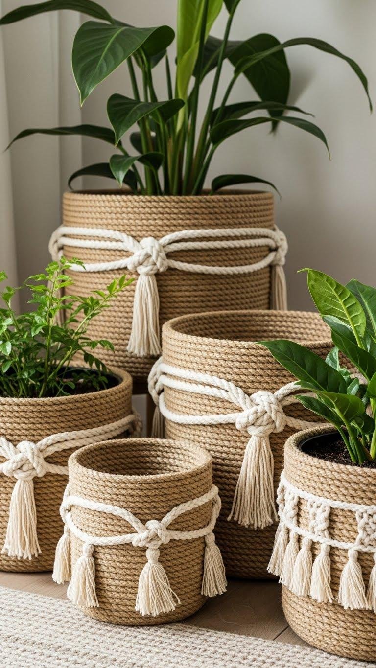
With a few lengths of natural rope and some simple glue, you can turn plain pots into textured, boho-ready planters that feel both grounded and refined.
You’ll wrap coils in clean lines, knot accents with nautical knotwork, and finish edges with subtle fringe tassels. Choose a cohesive palette, layer texture deliberately, and let each piece evoke effortless freedom in your plant corner.
Pebble-Embellished Pots
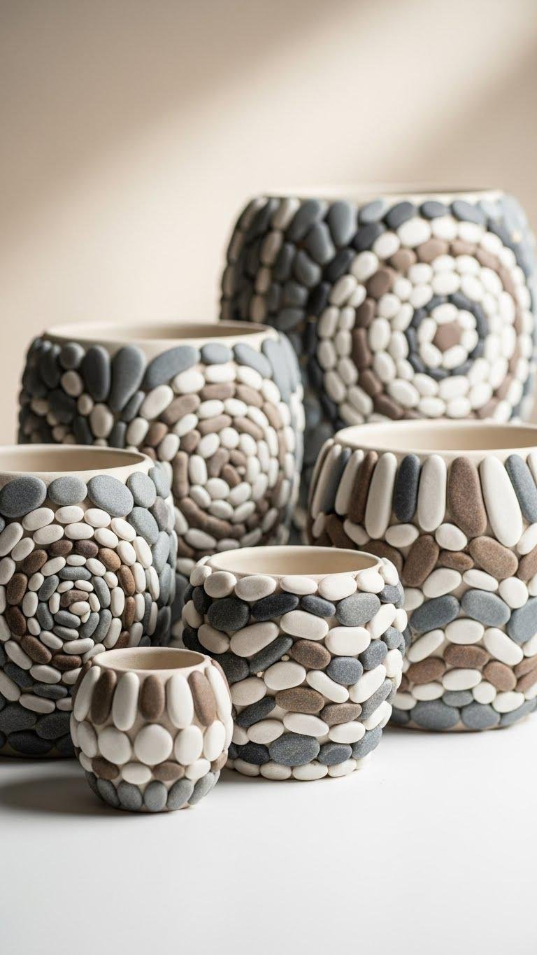
Against a backdrop of neutral tones, pebble-embellished pots add a quiet, tactile charm to your plant display. You’ll create calm contrast with polished pebbling arranged in pebble mosaics, keeping clean lines and a cohesive palette.
Layer texture subtly—adhere stones in deliberate patterns, seal for durability, and let each pot feel free, grounded, and effortlessly refined without clutter.
Pom-Pom Rim Accents
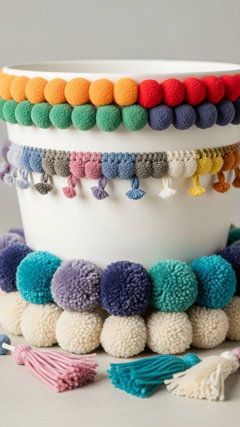
Add a playful, handcrafted edge to your pots by stitching or gluing a neat row of pom-poms around the rim; the result brings a soft, tactile contrast to clean lines and a restrained color palette.
You’ll pick yarn pom poms in a cohesive palette, balance sizes for layered texture, and mix subtle colorful tassels for movement — a liberated, modern accent that feels intentional.
Hot-Glue Nature Texture
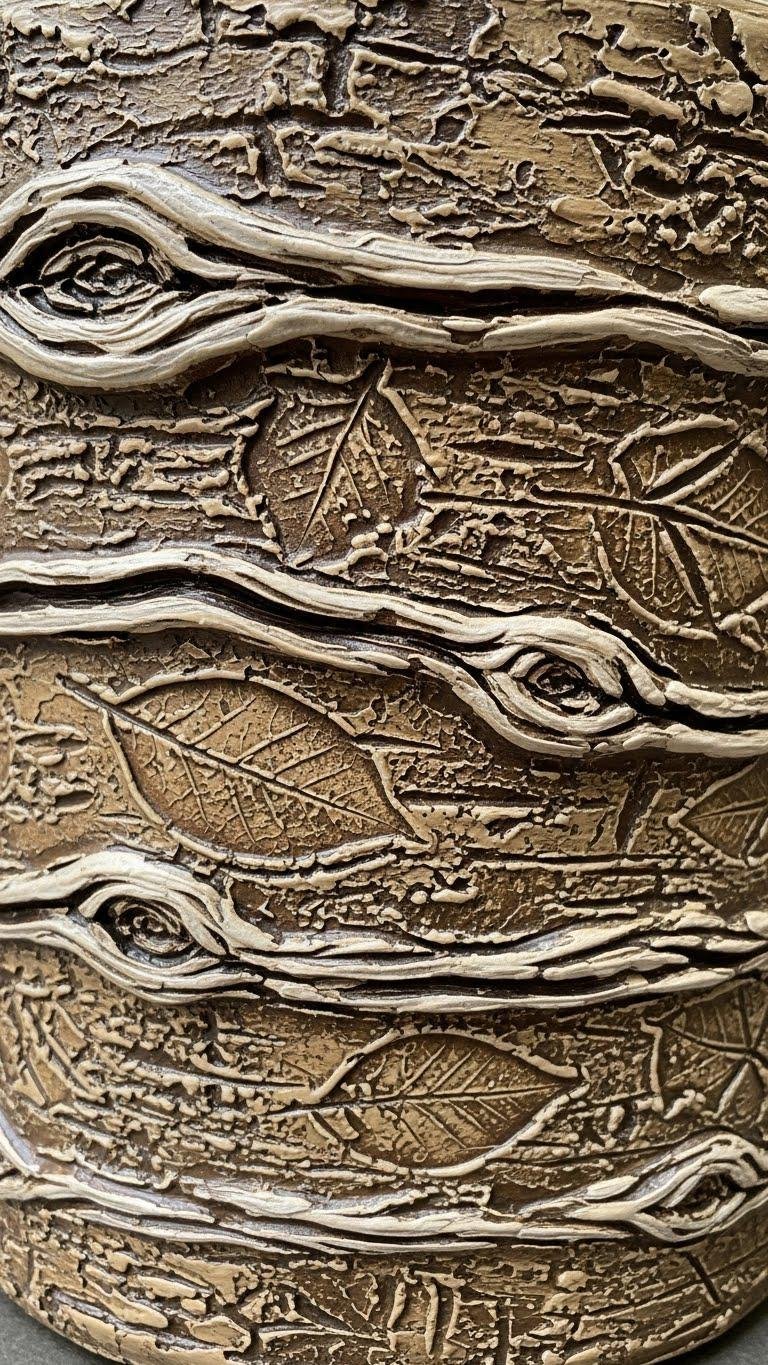
If you liked the soft, stitched feel of pom-pom rims, try using hot glue to build organic texture that reads like bark or lichen. You’ll sculpt ridges and gentle knots, then paint in a cohesive palette to mimic natural bark.
Press leaf imprints into warm glue for crisp detail. The result is layered texture with clean lines that frees your pots to feel wild, yet refined.
Decoupage Floral Wraps
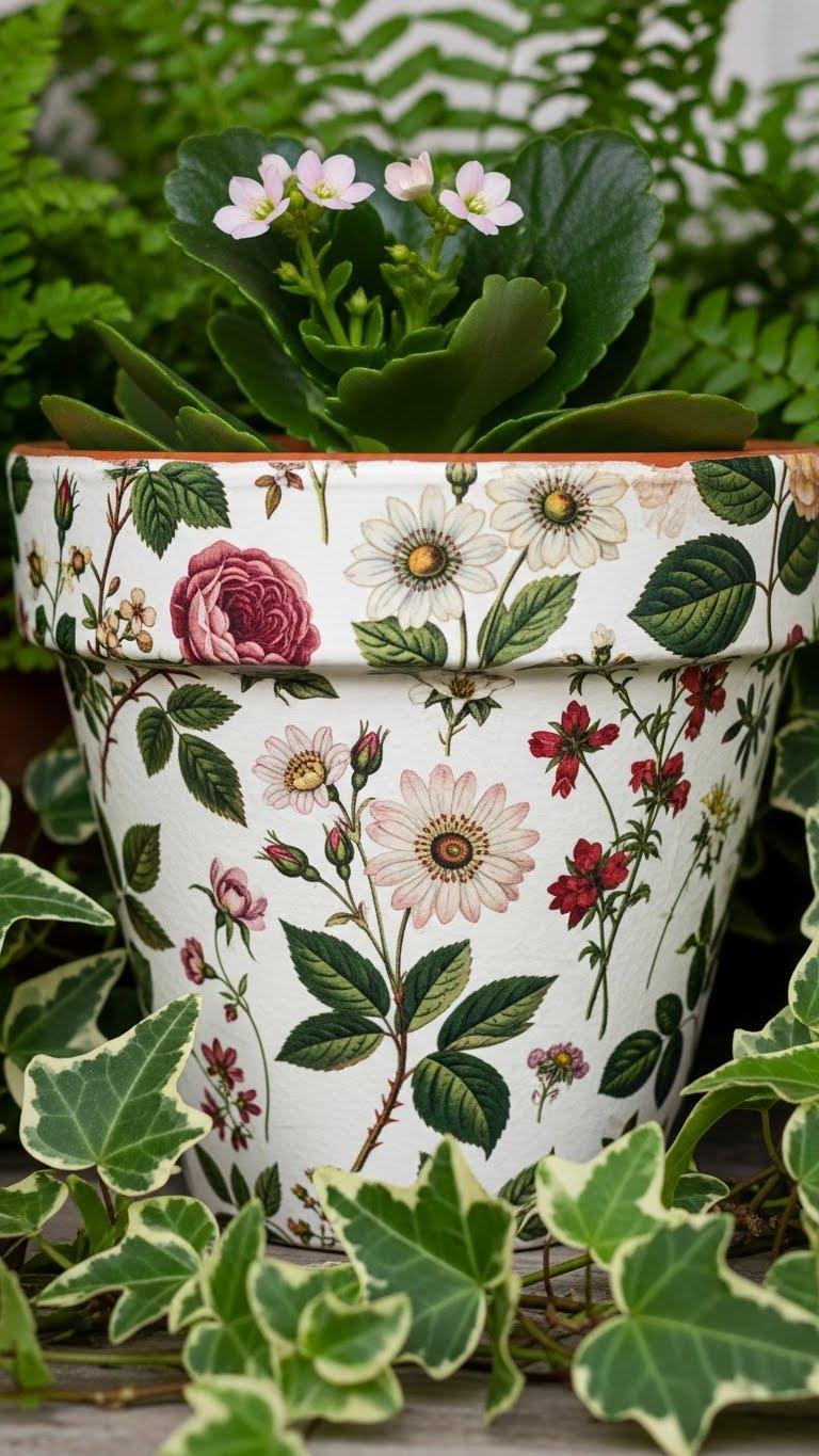
Decoupage floral wraps let you transform plain pots into layered art with minimal tools and big impact. You’ll select vintage botanical papers in a cohesive palette, smooth them around the pot, and brush thin adhesive for clean lines.
After drying, you’ll add a clear waterproof sealant for durability. The result feels textured yet restrained, giving your plants a liberated, refined backdrop.
Preserved Moss Base Detail

To complete the look, lay a preserved moss base around your wrapped pot to ground the design and introduce a soft, layered texture.
You’ll press moss gently, ensuring even moss hydration without overwatering, and shape edges for a clean silhouette.
The moss adds visual calm, subtle contrast, and practical root insulation, letting your plant feel free in a refined, cohesive arrangement.
Fabric-Swathed Containers
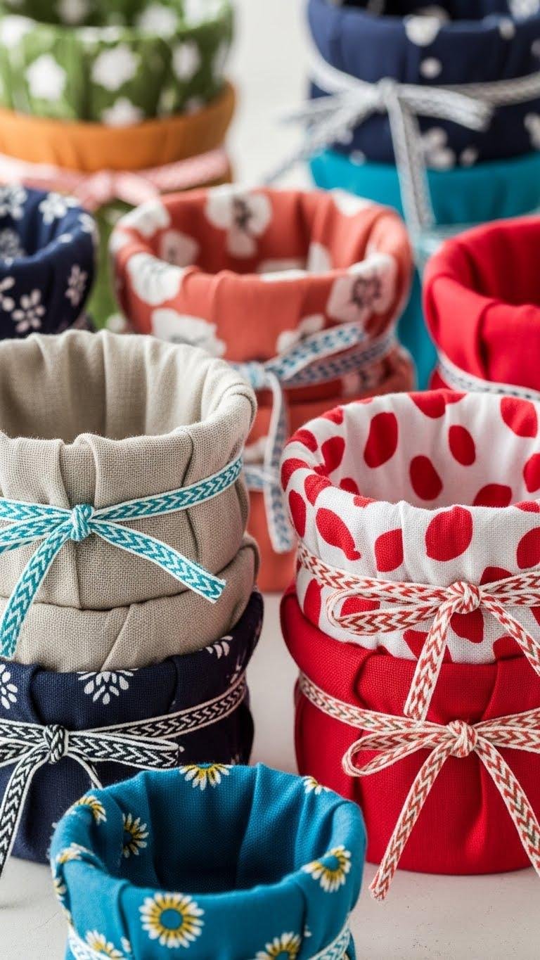
Often you’ll wrap a simple pot in fabric to add immediate color, pattern, and texture without committing to a permanent change.
You’ll choose linen wraps for a muted base, then layer bold accents to keep a cohesive palette. Secure pieces with patterned ties, trim neatly, and tuck edges for crisp lines.
The result feels free, edited, and tactile—plant-ready.
Copper-Dotted Accent Pots
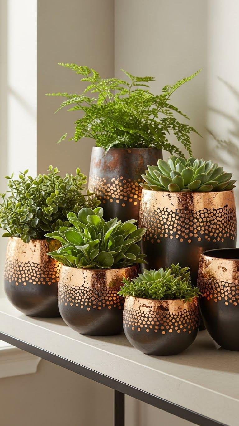
You’ll find copper-dotted accent pots bring a quiet, polished punch to any grouping, marrying warm metallics with matte surfaces for a layered-texture look.
You’ll apply metal leafing in controlled dots, then use patina layering to soften edges and add depth.
The result feels minimal yet adventurous, letting your plants breathe within a cohesive palette while you enjoy creative freedom and clean-lined style.
Chalkboard Label Swatches
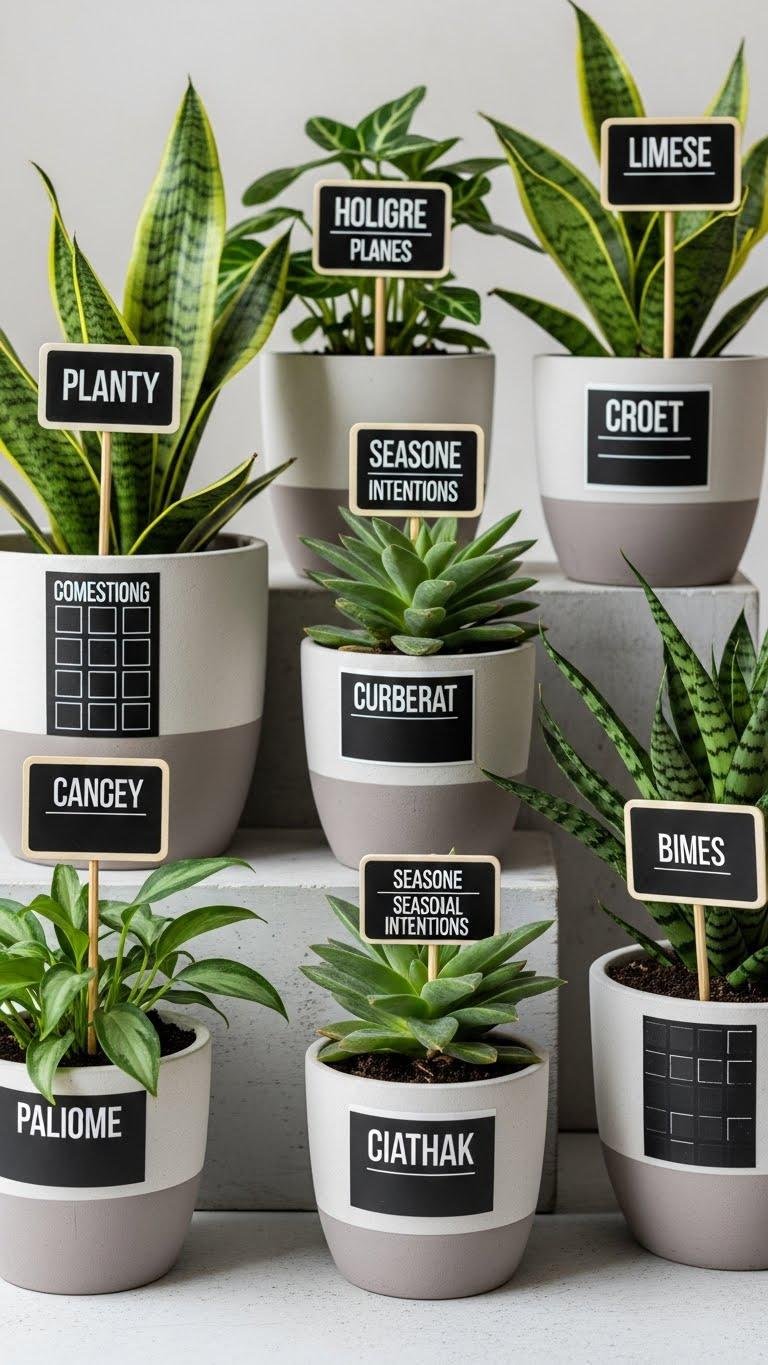
Give your pots a smart, utilitarian edge with chalkboard label swatches that blend matte texture and crisp typography. You’ll trace simple shapes, apply muted tones, then add chalkboard swatches for instant identity. Choose bold label fonts that read at a glance, erase and rewrite as seasons change, and keep lines clean, palette cohesive, texture layered—letting your plants and intentions roam free.
Vinyl-Lettered Herb Pots
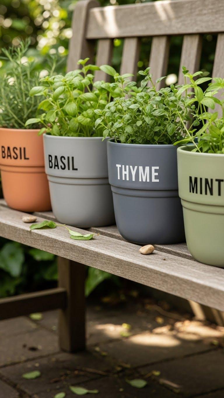
Stick vinyl letters onto matte pots to create crisp, readable herb markers that match a cohesive palette and let layered textures shine. You’ll choose personalized fonts and custom sayings to label basil, thyme, and mint with calm confidence. Keep lines clean, spacing precise, and colors muted so the text pops. Peel, press, and smooth for a liberated, minimalist garden statement.
Sealed Outdoor Paint Protection
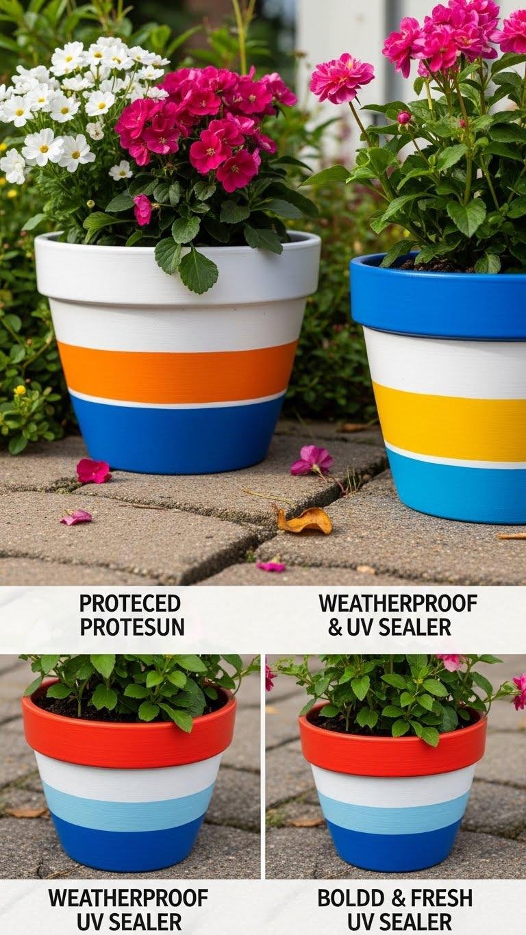
Often overlooked, sealing outdoor paint is what keeps your pots looking fresh through sun, rain, and seasonal wear.
You’ll choose a Weatherproof primer, then apply clean coats of paint and finish with a UV sealer for lasting color. This approach preserves crisp lines, a cohesive palette, and subtle, layered texture so your pots stay bold and free, season after season.
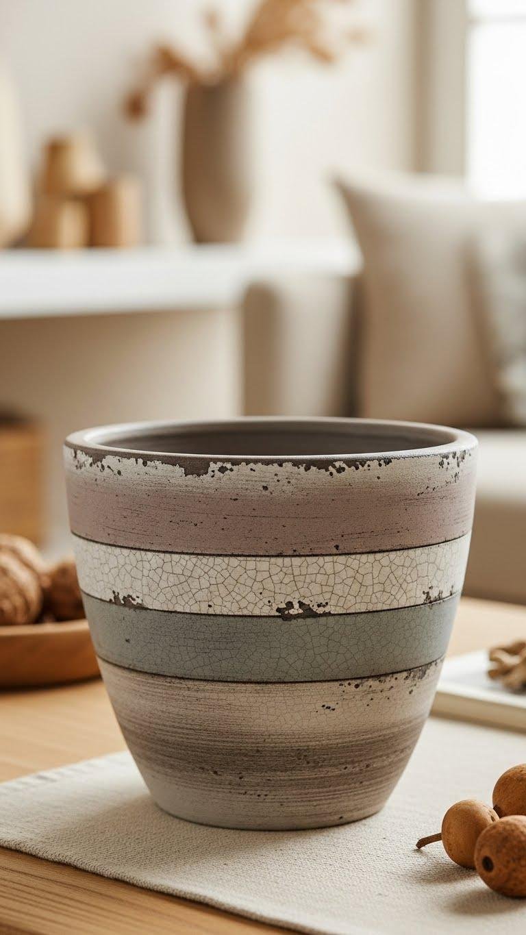
Layered Sand Stone Effect
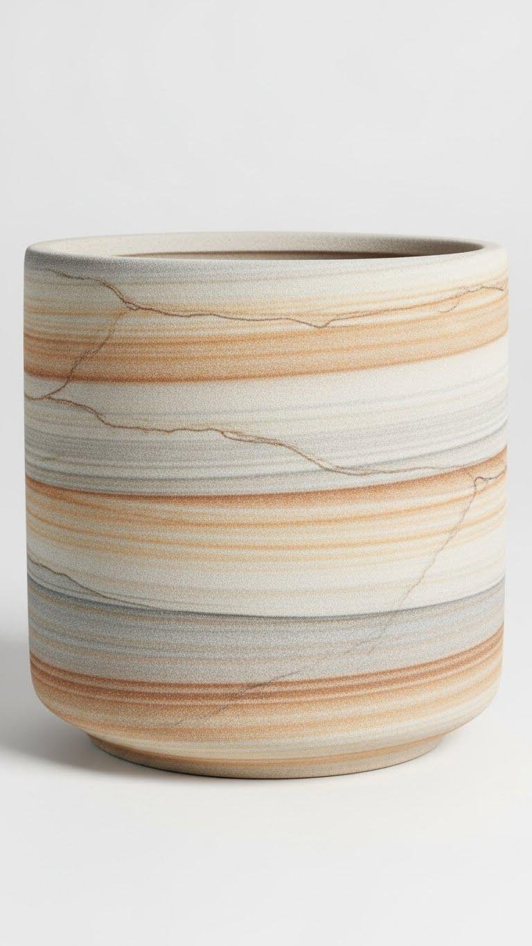
Create a layered sand stone effect by building thin washes of sandy neutrals and subtle textures that mimic natural strata. You’ll paint delicate bands, varying opacity to suggest stacked strata, then add faint sandstone veining with a fine brush.
Keep lines clean, a cohesive palette, and tactile layers. Let the pot breathe — you’ll achieve calm, rugged elegance without fuss, ready to hold your plants.
Painted Rim and Interior Contrast
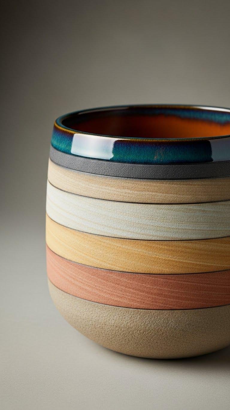
After laying down your layered sandstone bands, accent the piece by painting the rim and interior a contrasting yet harmonious shade to frame the strata and give the pot more presence. You’ll choose a matte rim to ground the look and a glazed interior for easy watering. Keep clean lines, a cohesive palette, and layered texture so your pot feels liberated and quietly bold.
Air-Plant Hanging Cups
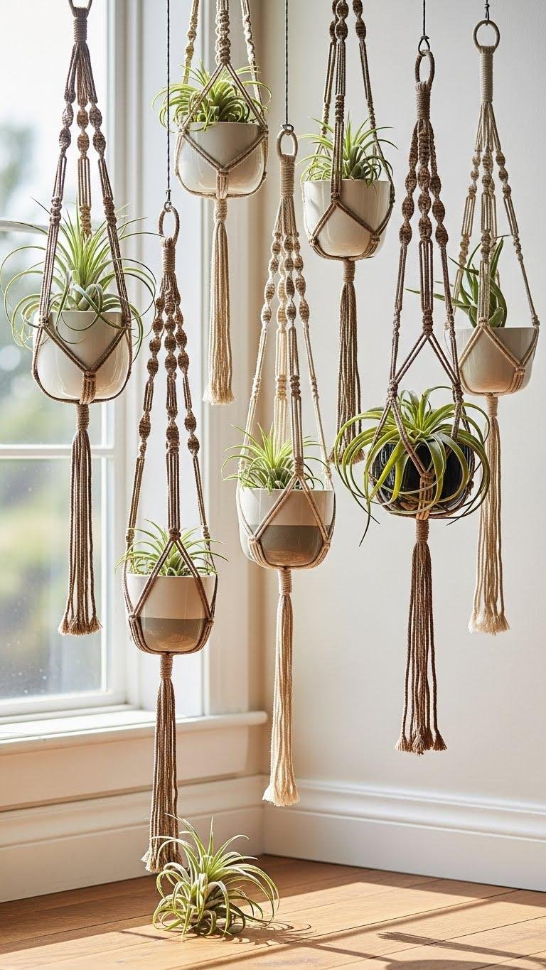
Why not suspend a sliver of greenery that feels sculptural and spare? You’ll craft air-plant hanging cups with simple shapes, a cohesive palette, and layered texture—glass or ceramic cups cradled in macramé holders.
Hang an airplant terrarium in a sunlit corner to free your space and spirit. You’ll enjoy minimalist form, tactile contrast, and effortless, floating greenery.
Minimalist Monochrome Classics
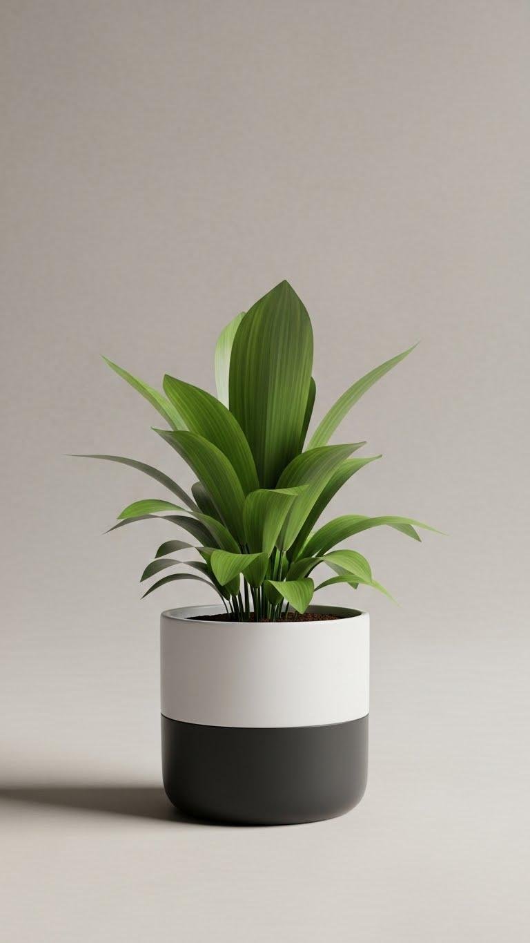
When you pare a pot down to a single hue and simple silhouette, the plant becomes the focal point and the form reads as calm architecture.
You choose a matte finish, crisp edges, and spare shape, then build interest through tonal layering and subtle texture. The result feels liberated — restrained, intentional, and ready to let your plant breathe and lead the room.
Distressed Vintage Look
Paragraphs
If you love the calm architecture of a single-hue pot but want more character, try a distressed vintage look that keeps clean lines while adding weathered charm.
You’ll sand edges, layer muted tones, and finish with an antique crackle or thin weathered glaze for depth.
The result feels open, lived-in, and deliberate—freedom expressed through a cohesive palette and layered texture.
Textured Grit Mix Pots
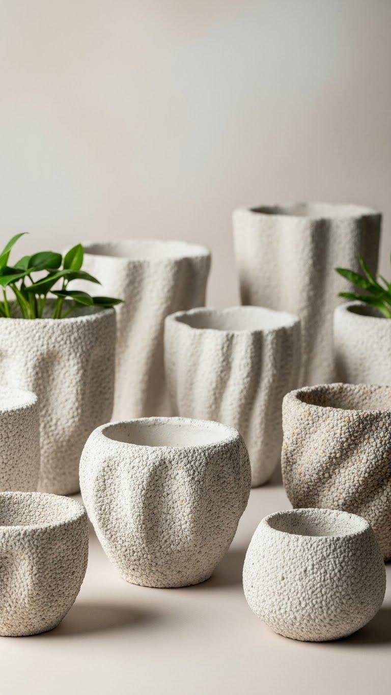
Bring texture forward by mixing gritty aggregates into your paint or plaster to create pots that feel sculpted and tactile. You’ll experiment with grit blending to build subtle relief, keeping color choices minimal and lines clean.
Shape layers deliberately, then finish with a matte tactile sealing to protect surfaces. The result feels intentional and free—functional art for plants that lets you play within a calm palette.
Mixed-Material Statement Planters
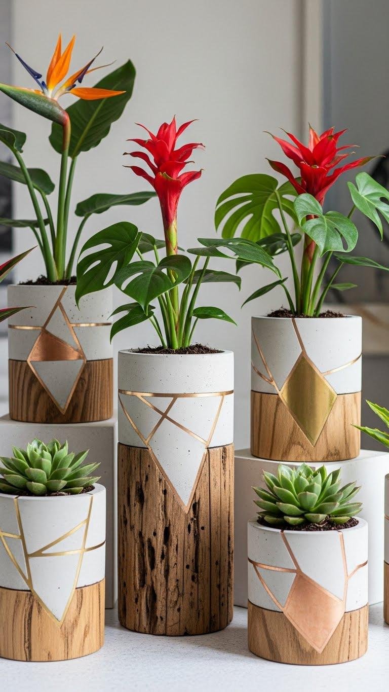
After exploring textured grit mixes, you can push the concept further by combining materials—concrete, metal, wood, and ceramics—to make planters that read like small sculptures.
You’ll pair reclaimed wood bases with smooth concrete shells, add metallic inlay accents for contrast, and keep a cohesive palette.
The result feels minimal, tactile, and freeing, inviting bold plants and personal expression.